ScreenSense Lab
A dashboard that turns students' screen-time data into a clear picture of what's actually hurting their sleep and mood.
I designed and built the ScreenSense Lab dashboard solo: cleaning a student survey dataset, engineering the usage/sleep/mental-health visualizations, and shipping it as a live, publicly usable tool.
Context
Who
Students and everyday social media users whose mood, sleep, productivity, and self-esteem are shaped by their online habits, whether they realize it or not.
What
A dashboard that turns screen-time data into personalized insights, built solo from a public dataset and shipped as a live, publicly usable tool.
Why
Tools that exist today only provide screen time data, with no context of the impacts. People need personalized insights, backed by data, to bridge the gap between mental health and their digital habits.
Goal
“Create an accessible, interactive application that helps users better understand the relationship between their social media activity and overall well-being.”
Research
Dataset
Used a Kaggle dataset on “Students' Social Media Addiction” featuring survey data from students globally, ages 16–25 in high school, undergraduate, or graduate programs. Data was collected through surveys recruited via university mailing lists and social media platforms.
Key insight: an excess amount of social media usage can negatively impact overall well-being, including stress, sleep, and other factors.
Metrics analyzed
- Average daily usage hours
- Sleep hours per night
- Mental health scores
- Relationship conflicts over social media
Sketches / early concepts
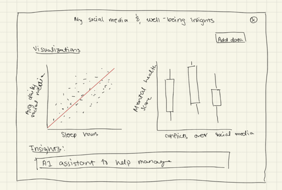
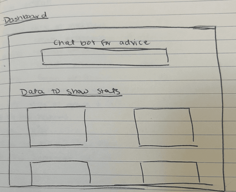
The initial sketch explored the first layout concept for the dashboard. After discussions with my professor and peers, I iterated on the design significantly; these were very preliminary, and the final dashboard changed substantially from these early concepts.
Insight
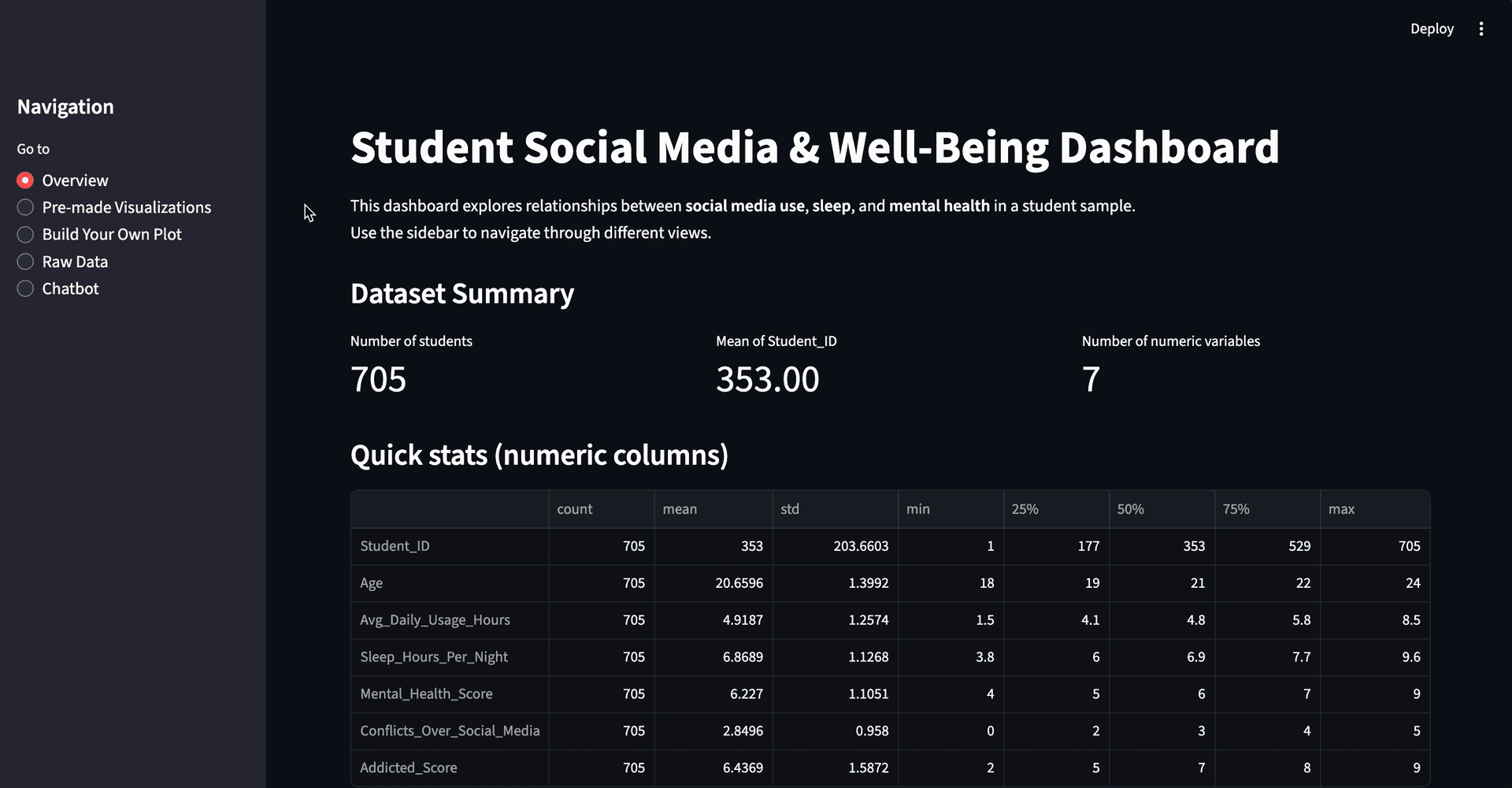
During final presentations, peers noted that the visualizations on the home page were overwhelming and hard to parse at a glance. That feedback became the turning point: the dashboard needed to separate “ask a question” from “explore the data,” instead of dropping both on users at once.
Initial homepage
Final homepage
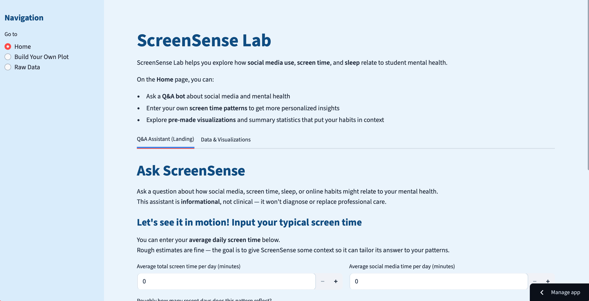
- Added manual user data input for personalized chatbot responses
- Separated visualizations into their own dedicated section
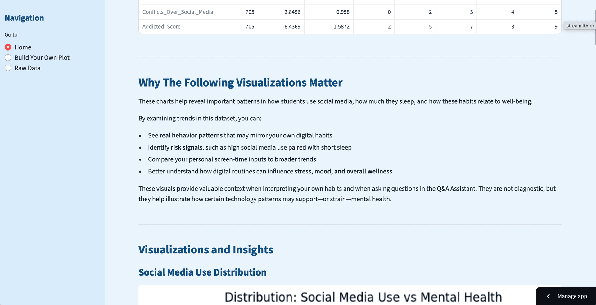
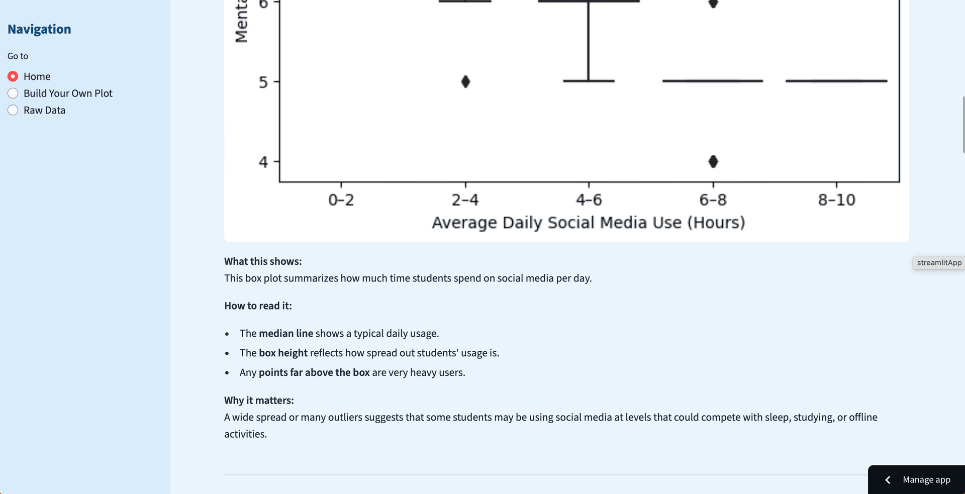
- Added explanations to each chart for easier interpretation
- Changed to a calming blue theme for a more approachable feel
Design
Core features
Manual screen-time input
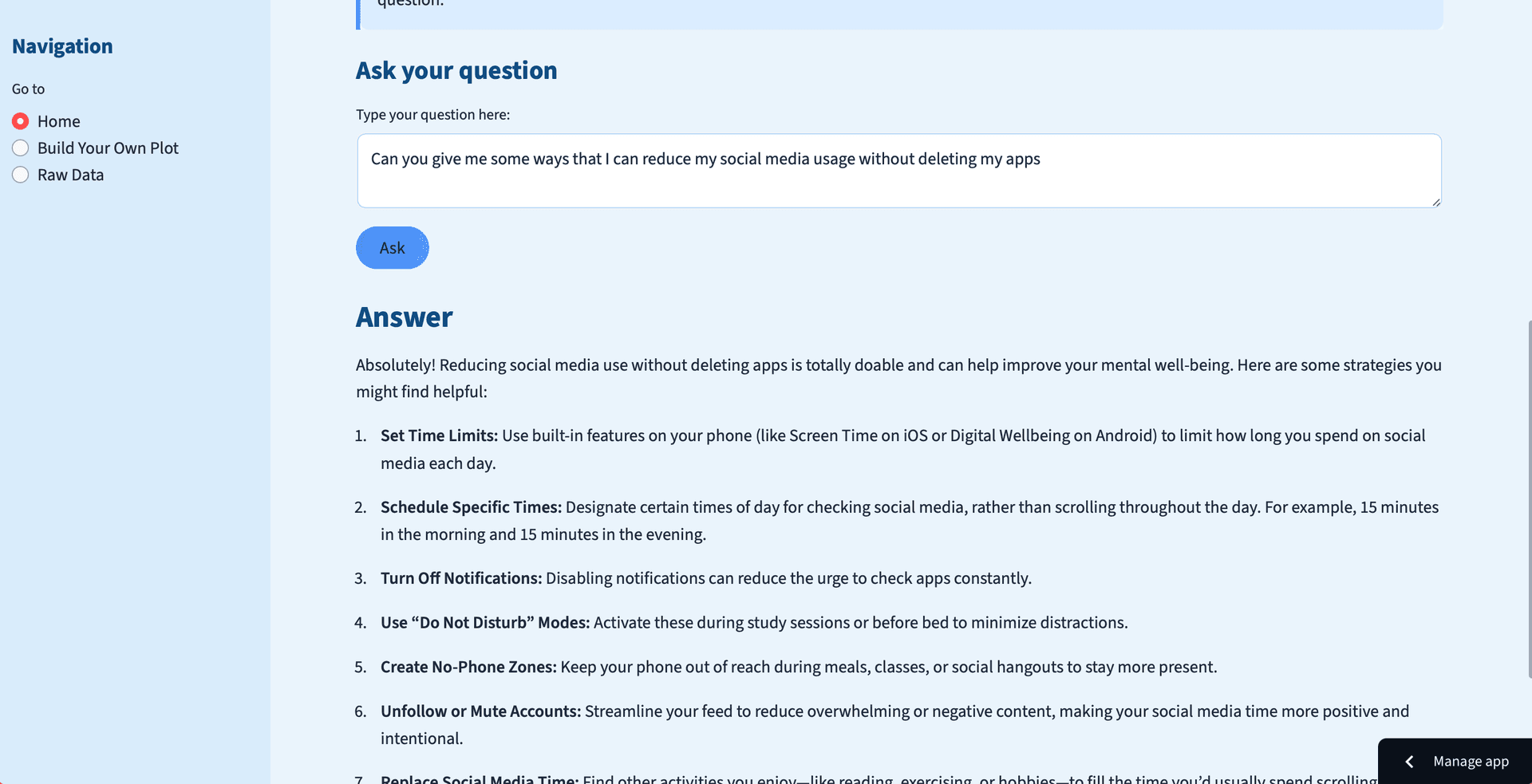
Users can input their own screen time data to receive personalized insights from the chatbot.
LLM chatbot
An AI-powered Q&A assistant that provides tailored conversational insights based on user data and the dataset.
Wellness insights
Personalized recommendations and patterns helping users understand how their habits affect well-being.
Built-in visualizations
Pre-built charts with explanations to help users easily interpret the data and understand why it matters.
“Build your own plot”
Users can explore additional aspects of the dataset by choosing which values they want to visualize.
Tech stack
Streamlit frontend, Python/Pandas/Matplotlib backend, OpenAI API via LiteLLM for the chatbot.
Dashboard screens
Outcome
The dashboard empowers users with self-awareness, allowing them to identify personal triggers and gain clarity regarding their digital habits. Future iterations include integrating an LLM directly with the dataset for tailored conversational insights and refining the UI/UX to a more intuitive, professional design.
Reflection
Bridging research and data
Bridging mental health research and digital behavior data shows how design and data-driven insight can promote healthier habits.
Peer feedback over assumptions
Peer feedback on a confusing first draft was more valuable than any assumption I made solo.
Tighter LLM integration
Integrate an LLM directly with the dataset for more tailored conversational insights.
Refine the UI
Refine the UI/UX to a more intuitive, professional design.
Next project
Shipt Search Filters →